Layer Settings
Table of contents
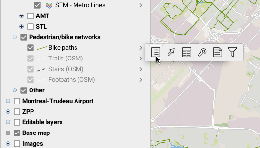
Layer settings allow you to define many options associated with map layers in JMap. The layer settings management window is accessed from the layer management window. It can also be accessed by double-clicking on the name of a layer.
All default settings have been set by the JMap administrator but you can modify these according to your preferences. However, layer setting changes are made locally and will be lost at the end of your session unless saved within a map context (see Map Contexts for more information).
General
This section presents the layer’s general settings.
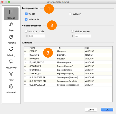
| 1 | Visible: Determines whether the layer is visible or invisible. Only visible layers are displayed on the map. Selectable: Determines if layer elements are selectable. If this option is not selected, the elements of the layer cannot be selected using the selection tools. Overview: Adds layer to application overview. Overview can be enabled by selecting View->Map overview or by using the CTRL-O keyboard shortcut. |
| 2 | Visibility thresholds define the scale range within which a layer is displayed on the map. If the displayed map scale does not fall within the minimum and maximum values, the layer will not be displayed. If the options are not selected, thresholds will be ignored. If a layer is grayed out in the layer manager, this indicates that it is not displayed due to visibility thresholds. Depending on what the JMap administrator has decided, it is possible that these options cannot be modified.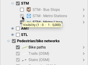 |
| 3 | Attributes that are bound to the layer’s elements are presented in this table. Attribute titles and types are indicated. Layer attributes are descriptive data associated with layer elements. They are used for mouseover bubbles, labels, thematic maps, etc. |
Style
The style determines the graphical representation of elements on the map. This section allows you to modify the style of a layer’s elements. There is a specific interface for each type of element (point, line, polygon, text, image, etc.) but several settings are common to all types. You can also define multiple styles for the same layer; each style is then used for a specific range of scales. Lastly, you can modify the style of selected elements on a layer.
The following interface displays existing styles for a layer.
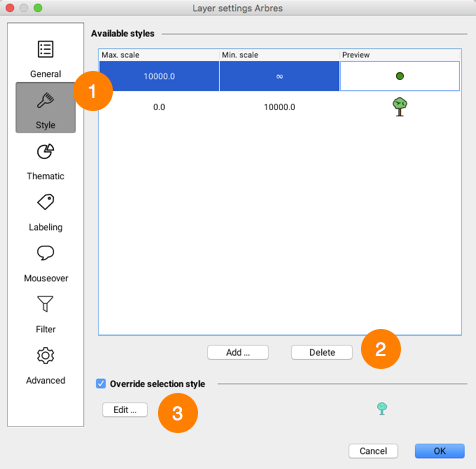
| 1 | This list displays existing styles for the layer. Each style applies to a specific range of scales. |
| 2 | Press Add… to create a new style for a given range of scales. Select a row in the table and press Delete in order to delete the corresponding style. |
| 3 | By default, the selection style for a layer is automatically created from the layer style and uses the project’s default selection color. You can modify a layer’s selection style by checking Override selection style and clicking on the Edit… button. |
General Style Properties
Some style properties are available for most types of elements.
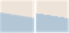
Antialiasing is a method of representing perfect, continuous vectors on imperfect, discontinuous display devices so that they look as perfect as possible. In every style configuration section of JMap, you can enable antialiasing. This will result in better looking maps. However, display performances are reduced when antialiasing is enabled, so use it judiciously.
The following figure shows an example of a polygon border with antialiasing (left) and without antialiasing (right).
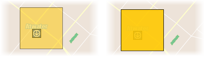
Partial object transparency can be used for every type of map element. A map element with a transparency value of 0% will be completely opaque, while one with a value of 100% will be invisible.
The following figure shows an example of a polygon with a transparency value of 50% (left) and one with a transparency value of 10% (right).
The blinking function makes layer elements blink on the screen. This property is not normally used for all of a layer’s data but rather for a subgroup of elements with a thematic.
Style Properties for a Layer of Points
| Style parameters | |
|---|---|
| Symbol | Select the symbol you wish to use to represent the elements. The symbol can be a vector symbol or an image.Vector symbols are provided with JMap and offer special characteristics compared to images. They can be resized without distortion and their fill color and border can be modified. However, they cannot be customized easily. Images are provided by the administrator and thus can be easily customized. |
| Size | Specify the size of the symbol. A value of 1 corresponds to the original size of the symbol or image. |
| Orientation | Specify the rotation to apply to the symbol. |
| Rotate symbol with the map | Select this option to have the symbol rotated when the map is rotated. If this option is not selected, the symbol will maintain its default angle, regardless of the map rotation. |
| Proportional size | Select this option if you want the size of the symbols displayed to vary in proportion to the map scale. You must enter the reference scale at which the symbols will be displayed in their normal size. |
| Offset symbol | You can enter values in pixels to offset the symbol vertically (Y) or horizontally (X). If the field indicates 0, 0, the symbol will be centered on the coordinates of the point. |
| Fill color | Specify the color of the interior of the vector symbol. For vector symbols only. |
| Transparent fill | Select this option to have the inside of the vector symbol completely transparent. For vector symbols only. |
| Line color | Specify the color of the lines of the vector symbol. For vector symbols only. |
| Border thickness | Specify the thickness of the border of the vector symbol. For vector symbols only. |
Style Properties for a Layer of Lines
| Style parameters | |
|---|---|
| Line | Specify the color of the line. |
| Line thickness | Specify the thickness of the line, in pixels. |
| Stroke | Specify the stroke style (dashed, solid, with border, etc.) to use to draw the line. JMap provides many stroke styles. |
| Border color | If the line has a border, specify its color. Refer to the Stroke parameter above for information on choosing a line with a border. |
| Border thickness | If the line has a border, specify its width. Refer to the Stroke parameter above for information on choosing a line with a border. |
| Arrow | Specify the arrow option you wish to use: None: No arrow. Forward: Place an arrow on the line pointing towards the last point of the line. Backward: Place an arrow on the line pointing toward the first point of the line. |
| Position (%) | If an arrow is used, this parameter determines its relative position. A value of 50% places the arrow in the center of the line. |
Style Properties for a Layer of Polygons
| Style parameters | |
|---|---|
| Color | Specify the color of the polygon’s interior. |
| Transparent fill | Select this option to have the inside of the polygon completely transparent. |
| Pattern | Specify the fill pattern to use. JMap provides many patterns. |
| Pattern color | If a pattern is used, specify its color. |
| Transparent pattern fill | If a fill pattern is used, select this option to make the pattern background completely transparent. |
| Border color | Specify the color of the polygon’s border. |
| Border thickness | Specify the thickness of the polygon’s border. |
| Stroke | Specify the stroke style (dashed, solid, with border, etc.) to use to draw the border of the polygon. JMap provides many stroke styles. |
| Transparency (%) | Specify the transparency to apply to the polygon’s border. |
Style Properties for Annotation (text) Layers
| Style parameters | |
|---|---|
| Font | Specify the font used to display the text. |
| Bold | Select this option to use bold text. |
| Italic | Select this option to use italicized text. |
| Underlined | Select this option to use underlined text. |
| Outlined | Select this option to use outlined text. The color of the outline may differ from that of the text, which improves the readability of the map. |
| Striked through | Select this option to use text that is striked through. |
| Text color | Specify the color of the text. |
| Outline color | If outlined text is used, specify the color of the outline. |
Style Properties for a Layer of Images
Only partial transparency may be adjusted for image layers.
Selection Style
Each layer possesses a selection style. Selection styles are used to represent elements when they are selected on the map. By default, the selection style is automatically generated using the layer’s basic styles and the project’s default selection color.
To modify the selection style, select Override selection style and press the Edit… button.
Thematics
This section allows you to create or modify a layer’s thematics. Each layer can have 0, 1 or more thematics and each of these can be enabled or disabled. The JMap administrator can define the default thematics that will be available for each layer of a project. As a user, you can also define your own thematics. Refer to Thematic Maps for general information on thematics in JMap.
The thematics management interface is as follows:
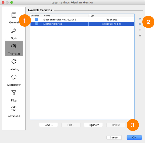
| 1 | This table shows the list of existing thematics for this layer. The first column is used to enable or disable thematics. Only enabled thematics are displayed on the map. |
| 2 | These arrows are used to modify the order of the layer’s thematics. If several thematics are enabled at the same time on the layer, it is important to consider their order to avoid having some layers hide others. It is normal that some thematics cannot be displayed simultaneously. |
| 3 | Press New… to create a new thematic. The thematic creation interfaces vary depending on the type of thematic selected. Press Edit… to modify an existing thematic. Note that thematics created by the JMap administrator cannot be modified. Press Duplicate to copy the selected thematic. An identical thematic will be created with a new name. Press Delete to delete the selected thematic(s). |
Creating Classification Thematics
Creating a graduated styles thematic
To create a new thematic of this type, you need to select the numeric attribute to use, define the number of categories, select the range calculation method and define the category styles.
There are several methods for calculating the ranges of values for the categories of this type of thematic. See Methods for calculating ranges for more information.
| Attribute | |
|---|---|
| Attribute | Select the numeric bound attribute to use. |
| Do not draw elements with out-of-sample values | If this option is selected, elements with values outside of the value range will not be displayed. This can happen when the data is modified after the thematic was created. |
| Create a category for null values | Select this option if you want null values to be represented in the thematic. |
| Categories | |
|---|---|
| Categories | Enter the desired number of categories. |
| Range method | Select the method used to determine the bounds of the value ranges. Refer to Methods for calculating ranges for more information. |
| Remove duplicated categories | In some cases, categories can have the exact same value limits. Select this option to avoid having identical categories. This can happen with very small data sets or if limits are rounded to big numbers. |
| Round at | Select the precision to use to round category range limits. It is often more useful to have rounded limits than very precise ones (e.g. country populations rounded to the nearest million). |
The next section allows you to define the styles of the categories. There are two possibilities: create custom range styles or use predefined color schemes.
Custom range styles
You must define the from and to values of the style by indicating the style variables that will vary (e.g. border thickness, symbol size, fill color, etc.). The category styles are then generated by interpolation between the from and to styles. Optionally, a third style can be used to create an inflexion point. If an inflexion is defined, the generated styles will pass through the inflexion point at the specified position in percentage. The interface is different based on the element type of the layer.
| Custom range styles | |
|---|---|
| Use inflexion point at | Select this option to use an inflexion point and specify the position of the inflexion. |
| Edit base style | Use this link to modify the style of the layer without leaving the Thematics section. The base style is used to produce the styles of the categories. |
Color schemes
Instead of manually defining styles, you can select a color scheme to generate the styles of the thematic’s categories.
| Color schemes | |
|---|---|
| Type | 3 types of color schemes are available: Sequential: The colors form a gradient of sequential colors (e.g. from white to red). Diverging: The colors form a gradient with a central color (e.g. from blue to white to red). Here emphasis is placed on central categories. Qualitative: Colors do not follow any sequence. |
| Apply to | You can choose to apply the palette to the available visual variables (e.g. fill, border, etc.), depending on the type of element on the layer. |
Creating a graduated symbols thematic
Only numeric attributes can be used for this type of thematic.
There are several methods for calculating the ranges of values for the categories of this type of thematic. See Methods for calculating ranges for more information.
The creation process is the same as for creating a graduated styles thematic, as described above.
Creating an individual values thematic
Numeric and alphanumeric attributes can be used with this type of thematic.
To create a new thematic of this type, basically all you need to do is to select the attribute to use.
| Individual values thematic | |
|---|---|
| Attribute | Select the bound attribute to use. It can be numeric or alphanumeric. |
| Do not draw elements with out-of-sample values | If this option is selected, elements with values not present in the value sample will not be displayed. This can happen when the data is modified after the thematic was created. |
| Create a category for null values | Select this option if you want null values to be represented in the thematic. |
JMap uses random colors for this type of thematic. You can modify styles manually or click on Color Schemes to use a predefined color scheme.
Creating an individual custom values thematic
Numeric and alphanumeric attributes can be used with this type of thematic.
The creation process is similar to creating an individual values thematic, except that you have the option to modify the list of individual values by adding, removing or modifying categories.
Creating Proportional Quantities Thematics
Creating a proportional symbols thematic
Only numeric attributes can be used for this type of thematic.
To create a new thematic of this type, you need to select the numeric attribute to use and define the from and to styles. The symbol size and color will be interpolated between the from and to values.
Creating a pie charts thematic
Only numeric attributes can be used for this type of thematic.
To create a new thematic of this type, you need to select one or more numeric attributes to use and define the chart style.
| Pie charts thematic | |
|---|---|
| Attributes | Select one or more numeric attributes. Each attribute will be represented by a piece of the pie chart. The size of the chart will be determined by the sum of those attribute values. |
| Do not draw elements with out-of-sample values | If this option is selected, elements with values not present in the value sample will not be displayed. This can happen when the data is modified after the thematic was created. |
| Ignore negative values | Select this option to ignore negative values. |
| Pie chart style | |
|---|---|
| Chart size | Select the from size (smaller) and the to size (bigger). The chart size will be determined by interpolation between these two values. |
| Border thickness | To draw a border around the chart, select a non zero border thickness. |
| Start angle | Select one of the directions to use as the starting angle of the chart. The first piece of the pie chart will start at the specified angle. |
| Draw shadow | Select this option to draw a shadow for the pie charts. |
| Labels | Select the label type (or none) to indicate the value or relative percentage of each piece of the pie chart. |
| Colors | Select the color of each portion of the pie chart. |
Creating a bar charts thematic
Only numeric attributes can be used for this type of thematic.
The creation process is similar to creating a pie charts thematic, as described above.
Creating a legend
The last step in creating any type of thematic consists of creating its legend.
| Legend | |
|---|---|
| Title | Enter a title for the legend. |
| Subtitle | Enter a subtitle for the legend. |
| Dynamic legend | For classification thematics only. Check this option to make the legend dynamic. A dynamic legend is constantly refreshed to display only the classes that are visible on the map displayed. |
| Preview | A preview of the thematic is displayed. |
Labeling
The Labeling section allows you to modify the settings of the layer’s labeling tools, including the labels’ contents (displayed text), look, and so forth. As a user, you can customize these settings.
The interface for managing a layer’s labels is as follows:
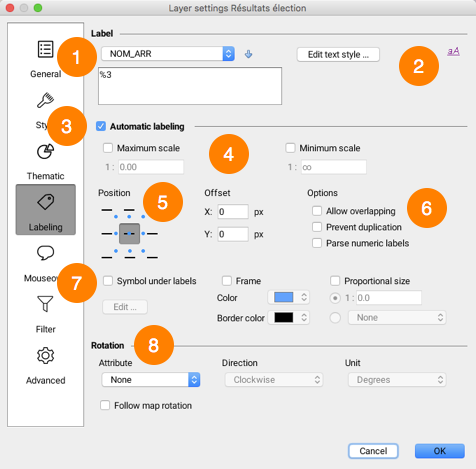
| 1 | Enter the text of the layer’s label. Use the ev(attrib) function to insert the attribute value specified in parenthesis. The attributes list allows you to select attributes and add them to the label text simply by pressing the button with the down arrow. Labels also support javascript programming to perform mathematic operations as well as operations on character strings using attribute values. The text can span several lines. |
| 2 | Press this button to modify the display style of the label text (font, size, color, etc.). |
| 3 | Enable automatic labeling in order to automatically display labels for layer elements according to specified parameters. |
| 4 | The maximum and minimum scales are used to limit automatic labeling to a certain range of scales. |
| 5 | Select the position of the label in relation with the element it identifies. Some positions are not available for all types of elements. |
| 6 | Allow overlapping: Allows labels of the current layer to overlap each other and overlap labels of other layers. Prevent duplication: Filters labels to be displayed in order to avoid repeating the same text. If several labels have the same text, only the first one will be displayed. This function is useful for street names. Parse numeric labels: If the label contains both text and numeric values, only the numeric values will be displayed. Useful when you want to display only highway numbers using an attribute containing other text (e.g. “Highway 40” becomes “40”). |
| 7 | Symbol under labels: Select this option to choose a symbol that will be displayed under the label text. Note that the label text must fit inside the selected symbol. This option is mostly used for highway symbols containing highway numbers.•Frame: Select this option to draw a frame around the label text. Color: You can select the color of the frame’s background. Border color: You can select the color of the frame’s border. Proportional size: By default, label text is always displayed with the specified font size, independently of the scale of the map. Use this option to have the label text size adjusted proportionally to the scale of the map. The text will appear in the specified font size when the map is displayed at the specified reference scale. When the scale of the displayed map is changed, the text size will be modified accordingly. |
| 8 | Rotation options allow you to control the way labels are rotated. Attribute: Choose the attribute containing the rotation to apply to each layer symbol. Only numeric attributes are available. Direction: If an attribute is used for the rotation, indicate the direction of the rotation (clockwise or counterclockwise). Follow map rotation: Select this option to have labels follow map rotation. If a map rotation is set, the same rotation will apply to the labels. |
Example of curved labels (left) and labels with a frame (right):
Example of labels with a background symbol:
Mouseover
This section allows you to define mouseover settings for the layer, such as the contents to be displayed, the color of the mouseover bubble, etc.
The mouseover configuration interface is as follows:
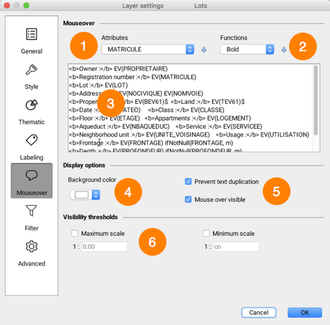
| 1 | The Attributes list allows you to select attributes and add them to the mouseover bubble’s contents by pressing the button with the downward arrow. |
| 2 | The Functions list allows you to select content formatting functions (bold, italic, etc.) and to add these to the mouseover bubble’s contents by pressing the button with the downward arrow. |
| 3 | Enter the mouseover bubble’s contents. This can include static text, as well as functions displaying attribute values, images, etc. Mouseover bubbles also support javascript programming to perform mathematic operations as well as operations on character strings using attribute values.For more information on defining the content of mouseover bubbles, refer to Creating Mouseover Content. |
| 4 | Select the mouseover bubble’s background color for this layer. |
| 5 | The following options modify mouseover behavior. Mouse over visible: Enable or disable mouseover for the current layer. Prevent text duplication: Avoid having content repeat itself within a bubble. |
| 6 | Visibility thresholds define the scale range within which mouseover bubbles are displayed on the map. If you do not select this option, the mouseover bubble will be displayed at all scales. |
Creating Mouseover Content
You must provide the text that will be used as mouseover content. This text can include static parts (displayed as is), variable parts (functions replaced by other values when the map is displayed), simple javascript programs as well as HTML tags. For example, the element value(city) function, or ev(city) in its abbreviated form, will be replaced by the value of the city attribute of the pointed element, when displayed.
The mouseover text can span multiple lines. Simply write the text over more than one line and the mouseover bubble will use the same formatting.
Mouseover syntax
The mouseover syntax is comprised of various functions that will determine the content of the bubbles. Functions and their parameters are generally not case sensitive. For instance, ev(city) is equal to Ev(CITY).
The following table explains the various available functions:
| Function | Description |
|---|---|
| elementValue(attrib) or ev(attrib) attrib: the name of an attribute | Replaced by the value of the bound attribute whose name is passed as a parameter for the pointed element. For example, ev(id) will be replaced by the value of the id attribute for this element. |
| elementId() | Replaced by the element identifier. |
| polygonArea() | Replaced by the area of a pointed polygon type element. |
| lineLength() | Replaced by the length of a pointed line type element. |
| centroid() | Replaced by the coordinates of the geometric centroid of the element’s geometry. |
| format(attrib, format) attrib: the name of a date or numerical attribute format: the desired date format | Replaced by a number or date that was formatted according to a specific format. Example: format(date_insp, dd/MM/yyyy)where date_insp is the name of an attribute containing a date and dd/MM/yyyy is the desired date format, as indicated in the documentation of the java.text.SimpleDateFormat Java class. Example: format(attrib, ##0,00)where attrib is the name of an attribute containing a number and ##0,00 is the desired number format, as indicated in the documentation of the java.text.DecimalFormat Java class. |
| ifNull(attrib, value) attrib: the name of the attribute to test value: the value to display if attrib is null | Replaced by the value value only if the value of the attrib attribute is null. If the attribute value is not null, nothing is displayed. Example: ifNull(temp, N/A)Displays N/A if the value of the temp attribute is null. Example: ifNull(attrib_a, attrib_b)Displays the value of the attrib_b attribute if the value of the attrib_a attribute is null. |
| ifNotNull(attrib, value) attrib: the name of the attribute to test value: the value to display if attrib is not null | Replaced by the value only if the value of the attrib attribute is not null. If the attribute value is null, nothing is displayed. Example: ifNotNull(land_value, $)Displays only if the value of land_value is not null. |
| subString(attrib, startIx, endIx) attrib: the name of the attribute for which a part must be extracted. startIx: starting position in the character string. endIx: ending position in the character string. | Replaced by a portion of the value (as a character string) of the attrib attribute, between the startIx position and endIx position. Example: subString(name, 0, 5)Replaced by the first five characters of the name attribute value. If this value is Montreal, the mouseover will display Montr. |
| encode(attrib, encoding) attrib: the name of the attribute to code encoding: the name of the encoding | Replaced by the value of the attrib attribute once it is encoded with the specified character encoding (UTF-8, CP437, ISO 8859-1, etc). Example: encode(name, UTF-8)Replaced by the value of the name attribute encoded in UTF-8 characters. |
| <script> code JavaScript</script> | Runs the JavaScript code found between the tags. In JavaScript, the attribute values of the elements are accessible through the elementValue() or ev() function.Mathematical operations or character string operations can be performed on attribute values. To display content in the mouseover, the script must call on the print() function.Example: <script> print ( ev(population) / ev(area) ); </script>Calculates and displays the result of the value of the population attribute divided by the value of the area attribute. Example: <script>var KM_IN_MI = 0.621371;var dist_mi = ev(km) * KM_IN_MI;print('ev(osm_name)');print(dist_mi.toFixed(1) + " mi");</script>Converts the distance in kilometers contained in the value of the km attribute into miles. Displays the value of the osm_name attribute and the distance in miles with a decimal figure. |
| <a href=”download:file URL“>some text</a> | JMap supports a special hyperlink syntax that allows a user to download a file by clicking on the link. The file to download can come from a http: or a file: URL. Example: <a href="download:http://someserver/123/report.pdf">Download</a>Displays a link that can be used to download the report.pdf file from the web. Example: <a href="download:file://D:/123/report.pdf">Download</a>Displays a link that can be used to download the report.pdf file from a Windows file system folder. |
| photosAsThumbnails() | Replaced by smaller versions of the images attached to the element. The user can click on a thumbnail to open the full size image.photosAsThumbnails(title) photosAsThumbnails(date) photosAsThumbnails(title,date) With these options, the title and/or date will be displayed with each thumbnail. It is very important that you do not add any spaces between title, the comma, and date. |
| projectName() | Replaced by the name of the current project. |
| userName() | Replaced by the user code of the user that is currently connected. |
| sessionId() | Replaced by the identifier of the current session. |
| host() | Replaced by the name of the host or address of the JMap Server instance to which the application is connected. |
| port() | Replaced by the port number (http or direct) of the JMap Server instance to which the application is connected. |
| date() | Replaced by the current date and time. |
HTML tags
The contents of the bubble can be formatted using simple HTML tags. Mouseover bubbles do not support CSS or advanced tags such as <DIV>. The following HTML tags are supported and frequently used in mouseover bubbles:
<B>, <I>, <U>, <A>, <IMG>, <BR>, <TABLE>
You can insert hyperlinks in bubbles. These hyperlinks can be clicked, and they allow users to open HTML pages or to open or download files.
Examples
| Mouseover content | Display |
|---|---|
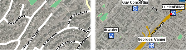
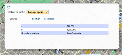
City : ev(CITY) A simple example of static text with the value of an attribute. | 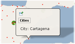 |
City: ev(CITY)(ev(COUNTRY)) Example containing static parts and displaying 2 attribute values on 2 lines. | 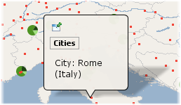 |
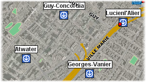
ev(STATION_NAME)<a href="ev(URL)">Site web</a>An example of basic formatting using HTML tags and a hyperlink where the URL comes from the value of the URL attribute. | 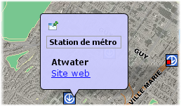 |
<b>ev(DESCRIPTION)</b><img src="ev(IMAGE_URL)" height="175" width="234" />An example of an HTML tag that takes the image URL from the value of the IMAGE_URL attribute. | |
Area : ev(AREA_KM2) km2 <script> var SQ_KM_IN_SQ_MI = 2.58998811; var area_sq_mi = ev(AREA_KM2) / SQ_KM_IN_SQ_MI; print(area_sq_mi.toFixed(1) + " sq. mi"); </script> An example of a <script> tag with JavaScript code. The value of the AREA_KM2 attribute is converted from square kilometers to square miles. | 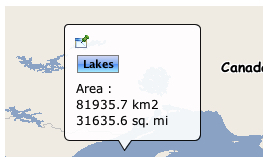 |
<table style="border:3px solid black; border-radius:5px; background: #1fc8db; color:white"> <thead> <tr> <th class="">Name</th> <th class="actions">FirstName</th> </tr> </thead> <tbody> <tr> <td class="">Gratton</td> <td class="actions">Bob</td> </tr> </tbody> </table> An example of formatting with a style attribute. | 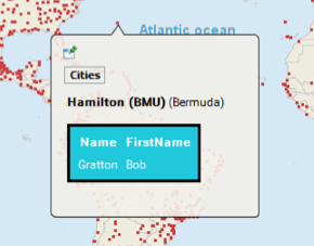 |
Locating map elements or coordinates using mouseover
Mouseover supports a function to locate map coordinates or elements using a special URL syntax. A hyperlink is displayed in the bubble, and when it is clicked, the map locates the specified element(s) or region.
| Mouseover locate example | Description |
|---|---|
<a href="locate:region;-73;45;5;5">Locate</a> | Displays a Locate hyperlink. When clicked, locates the region defined by x=-73, y = 45, width = 5, height = 5 in the same map. This is expressed in the map’s units. |
<a href="locate:object;subway;name;'atwater'">Locate</a> | Displays a Locate hyperlink. When clicked, locates the elements on the subway layer that have their attribute name equal to atwater in the same map. |
<a href="locate:object;subway;name;'a%'">Locate</a> | Displays a Locate hyperlink. When clicked, locates the elements on the subway layer that have their attribute name starting with letter a in the same map. |
<a href="locate:object;subway;name;'atwater';1000">Locate</a> | Displays a Locate hyperlink. When clicked, locates the elements on the subway layer that have their attribute name equal to atwater in the same map. The resulting map has a scale of 1 : 1000. |
<a href="locate:object;subway;name;'atwater':target=Result">Locate</a> | Displays a Locate hyperlink. When clicked, locates, in a new map called Result, the elements on the subway layer that have their attribute name equal to atwater. If a map called Result already exists, it is reused. If the name of the map was new, a new map (with an automatically generated name) would be created each time. |
Using a URL to display content
You can specify a URL that opens an HTML page to display in the mouseover bubble (only supported in JMap Pro). The HTML page will occupy 100% of the bubble. The syntax is as follows:
$URL{http://awebsite.com}
The specified URL can be static or it can come from an attribute. It can also use attribute values as parameters, as shown below:
$URL{http://awebsite.com?param1=ev(ATTRIB_A)¶m2=ev(ATTRIB_B)}
Filters
This section defines the filter parameters that can be applied to vector layers. You can filter the elements of a layer by configuring a filter. Items that do not match the filter criteria are not displayed.
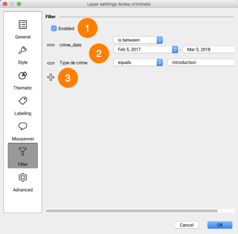
| 1 | Check the box to enable the filter. Items that do not pass the filter are not displayed in the layer. You can disable the filter without deleting it. |
| 2 | Attributes that make up the filter. Each attribute has an operator and an attribute value. Operators vary depending on the attribute type. |
| 3 | Click the icon to add another attribute to the filter. |
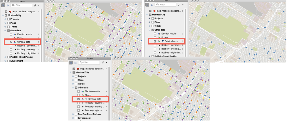
The  icon next to the layer name indicates that a filter is enabled. The filter can be disabled by unchecking the corresponding box. In this case all the elements of the layer are displayed and the
  icon indicates that a filter is configured for the layer.
Filter operators
equals: This operator filters a layer’s elements to display the elements whose attribute value (regardless of its type) is equal to one of the values selected by the JMap administrator or JMap Pro user.
does not equal: This operator filters a layer’s elements to display the elements whose attribute value (regardless of its type) is different from the values selected by the the JMap administrator or JMap Pro user.
greater than: This operator filters a layer’s elements to display the elements whose attribute value (numeric or date) is greater than the value selected by the JMap administrator or JMap Pro user. ==
greater or equal to: This operator filters a layer’s elements to display the elements whose attribute value (numeric or date) is greater than or equal to the value selected by the JMap administrator or JMap Pro user.==
less than: This operator filters a layer’s elements to display the elements whose attribute value (numeric or date) is less than the value selected by the JMap administrator or JMap Pro user.
less or equal to: This operator filters a layer’s elements to display the elements whose attribute value (numeric or date) is less than or equal to the value selected by the JMap administrator or JMap Pro user.
contains: This operator filters a layer’s elements to display the elements whose attribute value (text) contains the value selected by the JMap administrator or JMap Pro user.
is empty: This operator filters a layer’s elements to display the elements whose attribute (text) does not have a value.
is not empty: This operator filters a layer’s elements to display the elements whose attribute (text) has a value.
is null: This operator filters a layer’s elements to display the elements whose attribute value (regardless of its type) is null.
is not null: This operator filters a layer’s elements to display the elements whose attribute value (regardless of its type) is not null.
is between: This operator filters a layer’s elements to display the elements whose attribute value (numeric or date) is within the range defined by the two values entered by the JMap administrator or JMap Pro user.
is not between: This operator filters a layer’s elements to display the elements whose attribute value (numeric or date) is not within the range defined by the two values entered by the JMap administrator or JMap Pro user.
last: This operator filters a layer’s elements to display the elements whose date attribute value is within the range (expressed in years, months, week(s), day(s), hour(s)) defined by the JMap administrator or JMap Pro user.
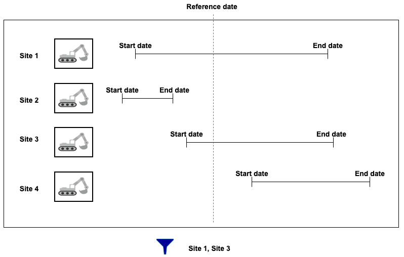
interval: This operator filters a layer’s data based on time ranges defined using a start date, an end date and a reference date. The user therefore has a tool to display data that varies over time.
The layer must contain at least two date and/or timestamp attributes, one of these being the start Date/Time, and the other being the end Date/Time. The values of these dates can be NULL to indicate a start date that goes a long way back or an end date that is very far in the future.
A reference date is also needed. This date can be a specific date (in the past or in the future) or a current Date/Time, which indicates the present moment.
Only layer elements whose reference date is between the start and end date are displayed in the map.
The following figure illustrates this filter.
Advanced
This section allows you to access advanced layer management settings. These settings are normally used by system administrators.